It’s that time of year again when Apple launches all of its new operating systems into public beta and invites a brave public to sift through bugs and crashes to find the nuggets of gold that Apple has been working on. With macOS Sonoma now in public beta, the big question is this: should you upgrade your Mac?
Well, this year’s update has been a rather modest one, with few truly standout features. After all, you know it’s an unexceptional update when Apple leads its list of new features in macOS Sonoma with screen savers.

The reason for this dearth of major features lies with the Vision Pro headset and its associated operating system, visionOS. This would have been a massive undertaking for Apple’s software engineers, so it’s no surprise that the company’s other platforms missed out.
So, what’s left? Is there anything of interest in macOS Sonoma? Should you upgrade? Well, I’ve spent the last few weeks using it and trying out the new features to gain an understanding of what’s good, what’s bad, and what’s downright ugly. Here’s what I found.
Desktop delights or disasters?

Let’s take a leaf out of Apple’s book and start with screen savers. This year, Apple has introduced a bunch of video screen savers that double up as desktop wallpapers. When the screen saver starts, the video begins from the image depicted in your wallpaper, before soaring through the air across landscapes, cityscapes, or through space. When you end the screen saver, it slows down and settles into place, with your wallpaper now showing the point at which the screen saver ended.
It’s a neat effect, and while it’s not really much more than a gimmick, it’s a pretty enjoyable gimmick at least.
Also updated are widgets, which have finally broken free of the Notification Center and sit proudly on your desktop. We’ve touched on desktop widgets before, and they’re a bit of a mixed bag, but they do show a lot of potential.
When you place more than one widget on your desktop, an alignment grid appears that lets you snap widgets into place. It’s helpful if you’re the kind of person who, like me, feels that desktop items like icons snapping to a grid is an absolute requirement of a usable operating system. No, I’m not neurotic, thank you very much.
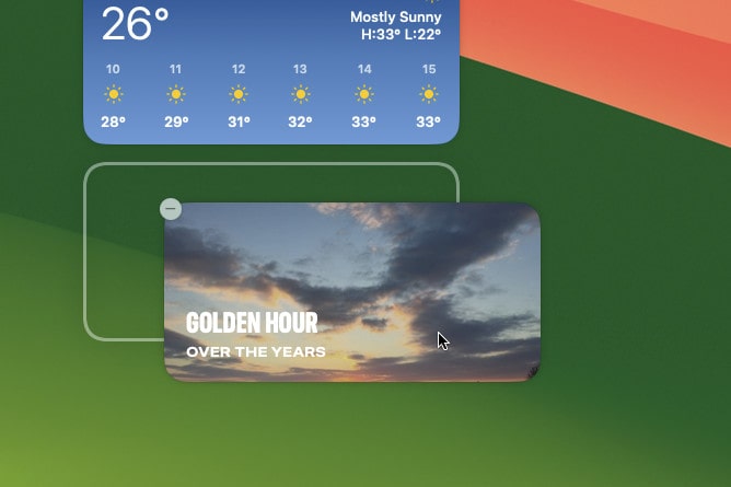
The best part of desktop widgets, though, is their interactivity. You can now check off reminders or launch shortcuts directly from the widgets themselves, without having to open the associated app first. It’s such a simple change, but it makes an impressively large difference. The time you save not having to open apps when you click on widgets adds up.
Apple says you’ll be able to run third-party widgets on macOS Sonoma, as well as those already on your iOS device (and you won’t need to install them on macOS Sonoma first). Unfortunately, neither of these features was working when I tested the operating system. They should arrive in a later beta update.
Finally, you can now natively turn any website into a desktop app that’s added to your Dock. I say “natively” because you’ve been able to do this for years with third-party apps but, as the company has a habit of doing, Apple has Sherlocked them and brought out its own version.
It’s decent enough and works best for websites you’re going to use like apps, such as Pinterest or games. It’s less useful for websites that you might just browse before wanting to move on to something else online, like news websites.
Video magic

Many of the new additions in macOS Sonoma focus on FaceTime calls. For instance, I was excited about the new controls over Continuity Camera that Apple has teased, where it looks like you’ll be able to adjust your camera’s zoom and pan, among other additions. I’d personally love to see more control over Portrait mode, but anything that brings calls closer to the power you get in the Camo app will be very welcome. Unfortunately, these features don’t seem to be in the latest beta, so I couldn’t test them.
Video reactions, however, did work. The idea behind these is you get a bunch of augmented reality effects based on your hand gestures during video calls. For example, put two thumbs up and an array of fireworks go off behind you on-screen. Or flash the peace sign and balloons rise all around you. Interestingly, these were leaked in a patent earlier this year, and while they are fun and quirky, they are a little slow to load at the moment.
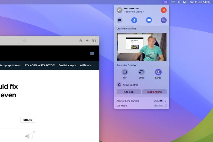
There’s a presenter mode, too. This activates when you share your screen and overlays your face on top of the content you’re sharing. You can opt to place the content behind you or put your face into a small bubble in the corner of the display. These are neat, although I saw a few rough edges where FaceTime was trying to cut around me and separate me from my background. With a bit of polish, they should be a useful addon.
During calls, a FaceTime button is inserted into the menu bar, meaning you don’t have to keep switching to the app in order to adjust your presenter mode layout, for example. Many of the controls in this button used to live in the Control Center, but popping them out into their own menu makes them less hidden and easier to access.
Get the message
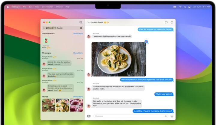
Messages has a few new features, but they’re mostly confined to additions that should have been present years ago. For example, swiping left to right on a received message lets you reply to it, something rival apps like WhatsApp have allowed for roughly 300 years. Better late than never, I guess.
There are new message filters, too, so you can search for a keyphrase only within messages sent from a certain person, for example. At least you can in theory — searching with filters was very hit-and-miss for me, sometimes finding results but other times missing them, even when I was staring the desired text string right in the face. This will hopefully be sorted out in a future update.
Finally, Live Stickers and Memoji have been moved into the same location. Just click the App Store icon next to the text field to find them. It’s fine, I suppose, but hardly a ground-shaking development.
Going out on Safari
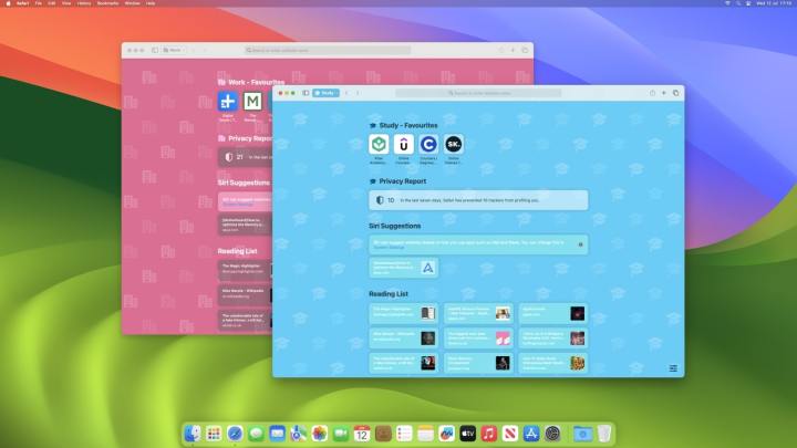
Safari has had a rough old time over the last few macOS betas, with a new look in macOS Monterey causing particular consternation. This year the changes are minimal, with the addition of profiles being one of the few changes of note.
Each profile can load its own extensions and save its own bookmarks. So, you could have a profile for work and a profile for studying and keep them almost entirely separate. Each profile can be found by clicking the related button in Safari’s top-left corner.
While it’s a nice idea, it needs a little refinement. Switching profiles is a bit clunky at the moment. You have to select a profile name in the corner, then choose New Window and pick a profile from the list. Doing so opens a new window, though, instead of just changing the existing window. This could leave you with a clutter of Safari windows on your desktop, which isn’t ideal.
Get your game on … kinda

Apple has been slowly increasing its gaming footprint in recent years, and the company has thrown gamers a bone in macOS Sonoma with the addition of Game mode. The company says this “gives games top priority on the CPU and GPU of your Mac,” as well as reducing latency for wireless accessories like headsets and controllers.
In my testing, I didn’t notice much difference in terms of performance. In Cult of the Lamb, I got similar results regardless of whether game mode was on or off, with performance on my M1 Mac mini hovering around the mid to late 50s in terms of frames per second (fps). In Rise of the Tomb Raider, meanwhile, I averaged the exact same 30 fps in the title’s built-in benchmark, both with game mode on and off.
It could be that Apple simply hasn’t ironed out the kinks in Game mode just yet. Given how desperately Mac gamers need a boost from Apple, we’ll be watching closely.
What else is new?
There are a wealth of changes coming elsewhere in macOS Sonoma, most of them fairly small. Notes and PDFs get a few new tricks, for example. In Notes, you can link two notes together with a hyperlink, allowing you to tie notes together and keep your content connected.
PDF files, meanwhile, will be able to let you autofill your information in relevant forms. This, though, wasn’t working when I tested it. Beyond that, you can now scroll through embedded PDF files in Notes, with a horizontal list of thumbnails at the top of the note. What’s lacking, though, is a page number indicator, which would help you keep your place in particularly lengthy documents.
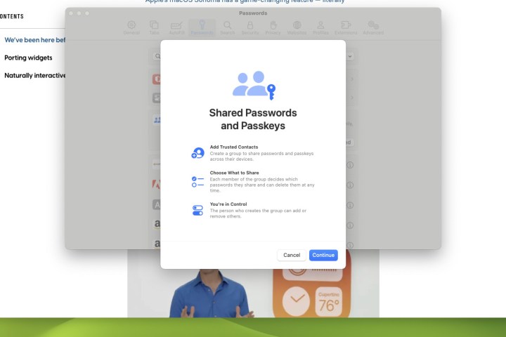
Apple has been an early adopter of passkeys, and macOS Sonoma will let you share these (and passwords) with other users. You’ll have control over which passwords they can access, and can revoke their permissions whenever you want.
Although that time wasn’t right now for me, since the feature was very buggy and wouldn’t let me add anyone to share a password with. Every time I tried, I was told the person “does not have a device that can join the group,” perhaps because they weren’t running the beta. Next to the name entry box was “LOCALIZED STRING NOT FOUND.” So yeah, pretty buggy.
A humble update

Due to the Vision Pro, macOS Sonoma is a necessarily humble update, far from the major shakeup of 2020’s macOS Big Sur. That doesn’t mean macOS Sonoma is totally devoid of interesting features, though, and there are plenty that show a lot of promise, from desktop widgets to passkey sharing.
But it’s also hard to get particularly excited about this upgrade. Sure, you should update your Mac to the latest version when it’s released in full later this year because there’s nothing especially offensive or Mac-breaking in here. But there’s also no need to hurry.
This should be unsurprising, really, considering how much engineering effort developing visionOS would have taken. It’s just a shame that Mac users won’t have too much to get the blood pumping.
Editors’ Recommendations
