
Apple is world-famous for its design success stories, from the iMac G3 to all the best iPhones. But things don’t always go according to plan, even for the most design-savvy tech firm on the planet.
No, Apple has had its fair share of design howlers over the years. Here, we’ve rounded up eight of the most egregious design sins Apple has ever committed. It’s a good reminder that no one is above dropping a few absolute clunkers — even Apple.
The butterfly keyboard
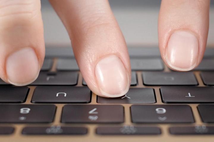
For many years, Apple exalted the concept of “thin and light” above seemingly all else. In the quest to strip back its designs to their purest essence, not even the keyboard could escape the steely gaze of Jony Ive and his fellow Apple designers.
The result was the butterfly keyboard, first debuted on 2015’s 12-inch MacBook. Instead of the traditional scissor switch mechanism under each key, this keyboard bore a new design that was much thinner and permitted far less key travel than before. Sure, it allowed the laptop to be almost impossibly thin, but it came at the cost of terrible reliability (and plenty of lawsuits filed against Apple).
Even the smallest crumb could jam up your keys and render them fickle and erratic. And with almost no key travel, typing on the keyboard felt like you were tapping a solid, immovable surface, which made errors increasingly common. Apple finally ditched the butterfly keyboard in 2019 and hasn’t looked back since.
Magic Mouse 2
The butterfly keyboard might have been abandoned, but this next design fail — the Magic Mouse 2 — is still with us. Buy a Magic Mouse 2 today and you’ll see it’s a real pain — quite literally.
For one thing, its low-profile shape can cause discomfort with prolonged use. I know at least one person who had to switch to a different mouse after it caused them severe wrist pain. Sure, its support for multitouch gestures is great, but is that worth the possible carpal tunnel syndrome?
That’s not the only problem. The most meme-worthy aspect of the Magic Mouse 2 is the way it charges, as Apple bafflingly located the charging port on the underside of the device. That means you can’t use it and charge it at the same time, and instead have to place it on its back like a rodent playing dead. That seems pretty appropriate, really.
The iMac G3’s ‘hockey puck’ mouse
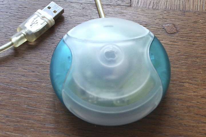
The Magic Mouse 2 wasn’t the first time Apple got a mouse badly wrong. No, over 15 years before the, Apple launched the iMac G3 and its design bomb of a mouse. While the iMac G3 is rightly celebrated as one of the best Macs of all time, its mouse is not remembered anywhere near as fondly. You certainly won’t find it on any lists of the best mice, that’s for sure.
That’s because it was completely circular (hence the “hockey puck” nickname). In practice, that meant it was extremely difficult to orient correctly without taking your eyes off the screen and looking down. You’d either hold it wrong and not be able to find its single button, or have to interrupt your work to get it the right way around. It was disruptive and annoying — hardly the hallmarks of great design.
The Touch Bar
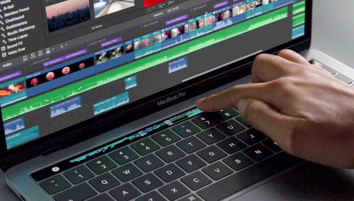
When Apple launched the redesigned MacBook Pro in 2016, its Touch Bar feature was heralded with much fanfare by the company. This touch-sensitive strip would provide handy app-specific shortcuts whenever you needed them and would even let you quickly type emojis into any message. What’s not to love?
Well, its shortcomings became apparent over time. Although a few apps had built-in support for the Touch Bar from the get-go, many didn’t, and uptake was slow. It wasn’t long before the Touch Bar felt like it was stagnating and unable to live up to its potential.
What’s more, it replaced the MacBook Pro’s row of physical function keys, which were well-liked by many users. Apple eventually reinstated a physical Escape key in later iterations, but the absence of a proper function row was keenly felt. Apple righted that wrong when it dropped the Touch Bar in 2021.
1st-generation Apple Pencil
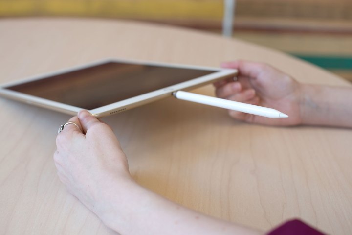
Don’t get me wrong, I like the Apple Pencil. It brings a great level of extra functionality to the iPad and feels well-thought-out and well-designed.
In every way except one, that is. You see, the first-generation Apple Pencil came with a Lightning connector at its top end. To charge the device, you had to plug it into the iPad’s Lightning port, making your tablet look like some sort of bizarre tech stingray.
Worse, this perplexing arrangement put the Apple Pencil at a huge risk of snapping if it was knocked while charging, as a frightening amount of pressure would be channeled through its Lightning connector. It might have been a fine device, but its peculiar — and risky — charging method was an inescapable design fail. Fortunately, Apple fixed it in the second-generation model.
The ‘trash can’ Mac Pro
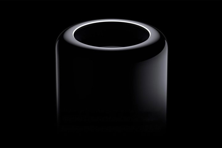
When Apple’s marketing chief Phil Schiller unveiled the new Mac Pro in 2013, he uttered one of the most infamous lines in launch event history: “Can’t innovate anymore, my ass.” The irony is that the design he revealed actually prevented Apple from innovating further down the road.
You see, the 2013 Mac Pro (known informally as the “trash can” Mac Pro) was a pretty clever device, with all its components designed around a cylindrical cooling chamber. It was a marvel of engineering and highly proprietary. But the problem with proprietary designs is they’re very difficult to upgrade in the future.
Apple admitted as much in 2017, when an uncharacteristically candid Schiller said the Mac Pro was “constrained thermally,” which “restricted our ability to upgrade it.” As a result, the 2019 Mac Pro was far more modular. The 2013 model, meanwhile, is a great example of how a design that wows in the short term can lead to headaches in the long term.
AirPods Max Smart Case
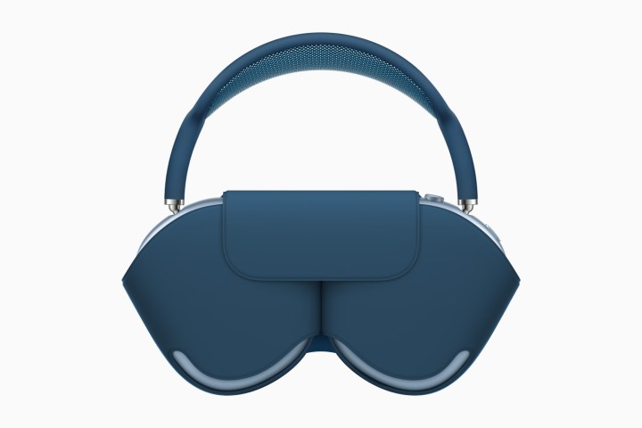
The AirPods Max Smart Case might be the most ironically named product Apple has ever released. That’s because it’s barely a case at all, and definitely not a smart choice. Wrap up your AirPods Max inside the Smart Case and you’ll see only about half the headphones are actually covered. It seems much more like a fashion accessory than a case.
While it’s kind of clever in that it resembles a handbag, that’s definitely not what most people want from a headphone case because it offers next to no protection at all. If you were hoping to keep your AirPods Max safe from bumps and bruises, you’re out of luck.
Even more annoyingly, using the Smart Case is the only way the headphones can enter low-power mode. Ditch the case and you need to wait a couple of hours for them to shut down, and all the while they’re draining the battery.
Style? Check. Substance? Not so much.
iPhone Smart Battery Case

What is it with Apple devices that have “Smart” in their name? Next up is the iPhone’s Smart Battery Case, which instantly became something of a meme thanks to its bizarre design.
While Apple’s rivals opted for more bulky charging cases, Apple went for a stripped-back look, leaving the battery oddly protruding from the back of your phone. Unfortunately, this design made it look like the case had swallowed the battery, and that it was ready to burst out at any moment.
The bulbous design even prompted Tim Cook to step out and defend the case, and that’s never a good sign. Fortunately for him, Apple later ditched the Smart Battery Case in favor of the MagSafe Battery Pack, which is slightly more elegant (although really, it’s not that difficult).
The Newton MessagePad
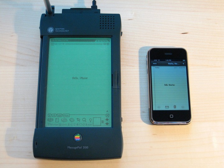
The iPad has been a massive success for Apple, yet it wouldn’t exist were it not for the Newton MessagePad. This handheld personal digital assistant (PDA) launched in 1993, but was plagued with problems almost from the beginning.
The MessagePad — and perhaps the world — simply wasn’t ready when it launched. Its handwriting-recognition software was so inaccurate that it was even mocked on The Simpsons, yet the device was still pushed out ahead of time, perhaps because it was the pet project of Apple’s then-CEO John Sculley.
Ultimately, the MessagePad was a great idea designed poorly. When Steve Jobs returned to Apple in the late 1990s, he axed the company’s entire Newton division. Yet, with more mature technology and a few design tweaks (including dropping the stylus), the MessagePad idea lived on in the form of the iPad.
Editors’ Recommendations